The Dashboard explained
Note: The chart descriptions are for the default cycling layout template (Bundle). As of July 3, 2019 there is also a default Running Dashboard layout template which can be loaded by clicking on the hamburger menu top left. Select add and check the options in the pop up.
When you first start TP and click on the dashboard tab you are presented with the default Dashboard layout which is where you find all your data analysis charts.
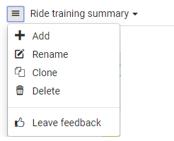
You can change a chart to a different chart by clicking its hamburger menu (top right) and selecting “change widget” (The charts are called widgets the containers they live in are called panels). Select the new chart from the menu popup that appears.
Hovering over charts reveals more detailed information either directly on the chart or using and Info popup.
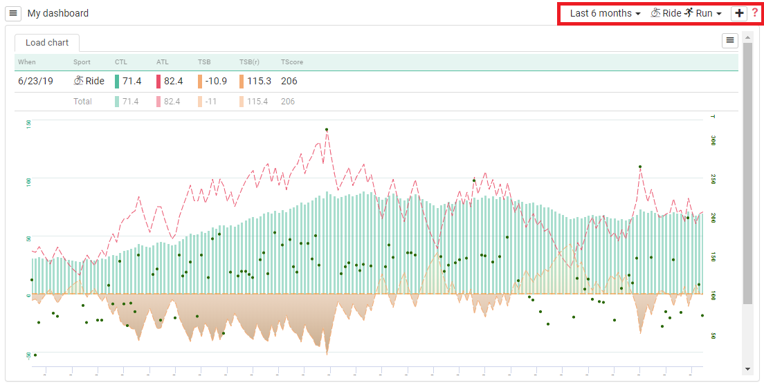
In the top right corner of the view is a menu (see red box below) to set global options for that view: Time period included and sport/sports types included.
Each Chart has its own options menu top right of the chart panel (see green box below) which lets you set options for that chart and over-rides the global options.
By default there are four cycling Dashboard views that can be selected from the Dropdown menu (top left).
Here’s what each Dashboard view shows by default:
Dashboard View: Ride Performance Tracking
![]()
Load Chart: (Equivalent to Training Peaks Performance Management Chart - PMC). This is a critical chart. It’s at the bottom of the view by default. I moved it to the top (Just hover over the chart header until you get the 4 pointed arrow and then left mouse click and drag and drop).
Distribution Charts showing metrics over the last 12 Months
(With drill in into years, months and weeks by hovering over chart top right and clicking +/- magnifying glass)
- Distribution Bar Chart 1 – Percentage time at each speed
- Distribution Bar Chart 2 – Percentage time at each Heart Rate
- Distribution Bar Chart 3 – Percentage time at each speed
Performance table: Shows progress on key metric over time in numbers: Current, Best, 1 month ago, 3 months ago, 6 months ago, 12 months ago.
Ability Graph: This graph compares your best and last performance in these abilities: Peak Power, Sprint, Long Sprint, Lactate Tolerance, Max Aerobic Power, Sustained Aerobic Power, Short Endurance, and Long Endurance.
Performance table: Plots progress on key metric over time.
Scatter: Quadrant analysis of Heart Rate vs Watts
Peak Power Curve: Peak power: best ever vs Last 12 months.
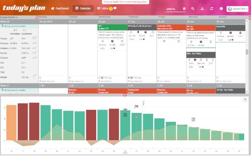
Dashboard View: Ride Training Summary
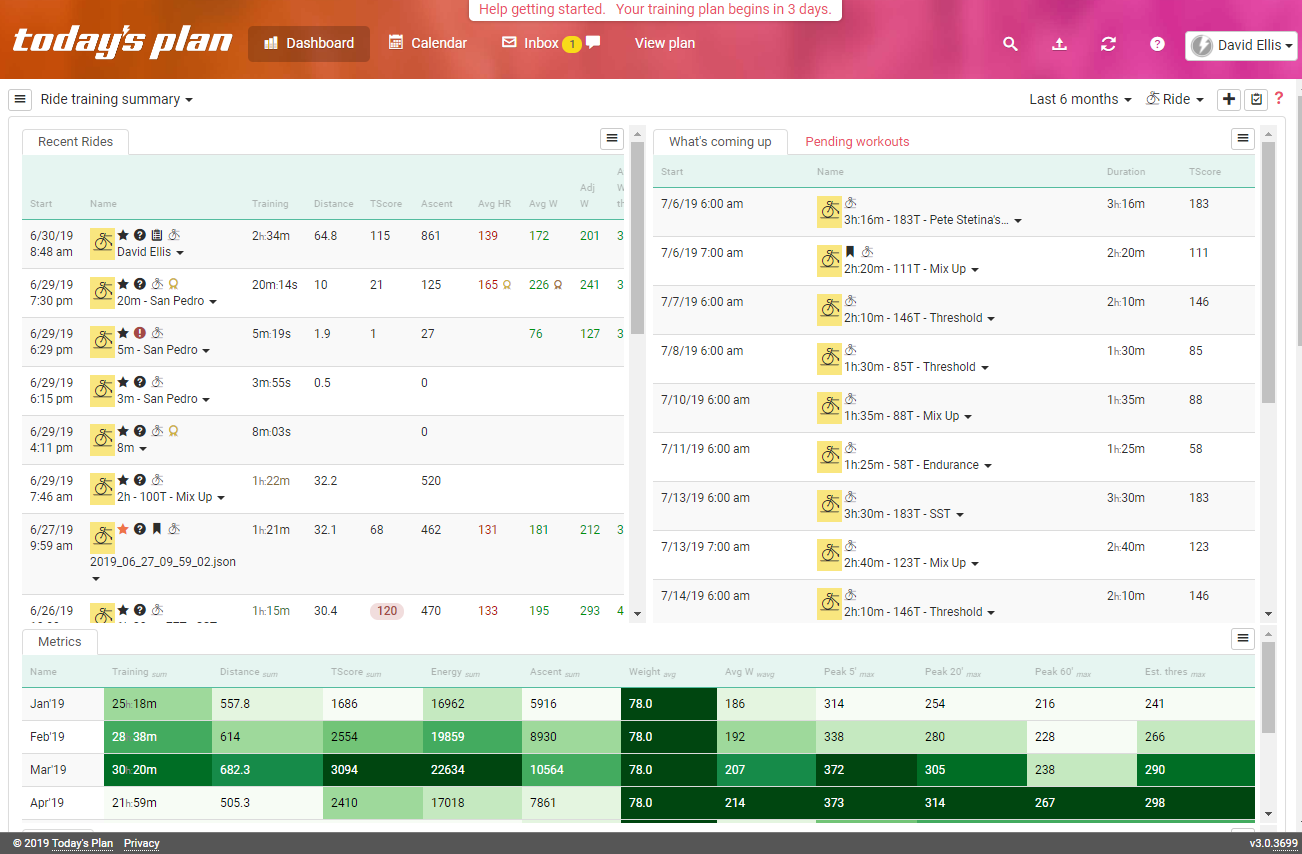
Recent Rides: A list of your most recent rides. Click on the green header and a chart icon appears that lets you choose what’s coming up, recent activities or pending workouts.
You can also limit activities displayed between 5 and 100, and filter on favorites and achievements
What’s coming up: A list of your upcoming planned workouts. Click on the green header and a chart icon appears that lets you choose what’s coming up, recent activities or pending workouts.
You can also limit activities displayed between 5 and 100, and filter on favorites and achievements
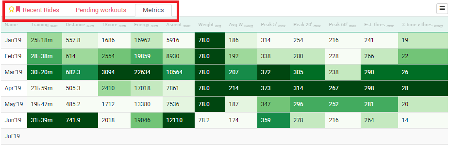
Metrics: A table of KPI’s: Click on the green header and a chart icon appears that lets you choose how KPIs are displayed: Show by Days/Weeks/Months, Show Heat Map, Show Bests and Show Stats.
Sample Metrics Table with Heat Map
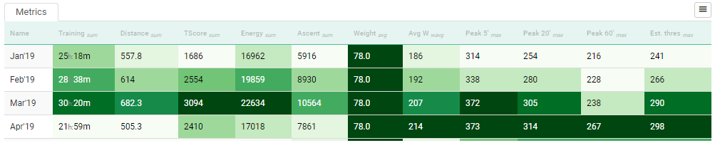
Sample Metrics Table with Bests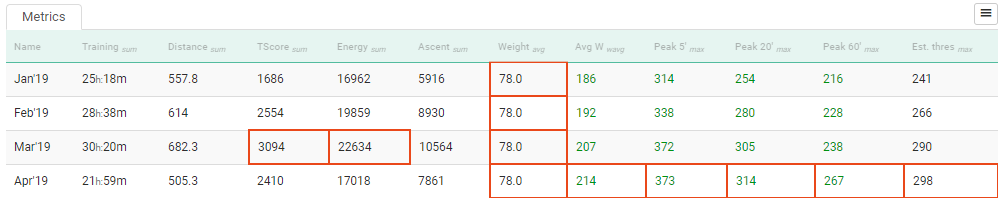
Training Load Summary: A detailed table showing key metrics about the amount of training you have done by year, month, week or day (using drill in).
Metrics include total distance, total Duration, T Score, amount of average watts > Threshold watts, RPE, and weight change.
Peak Power Table and Curves: Compares peak power, both absolute and in W/Kg, over last 6 months with your best ever. Displayed as a table, and also as two charts.
Dashboard View: Ride Training Zones
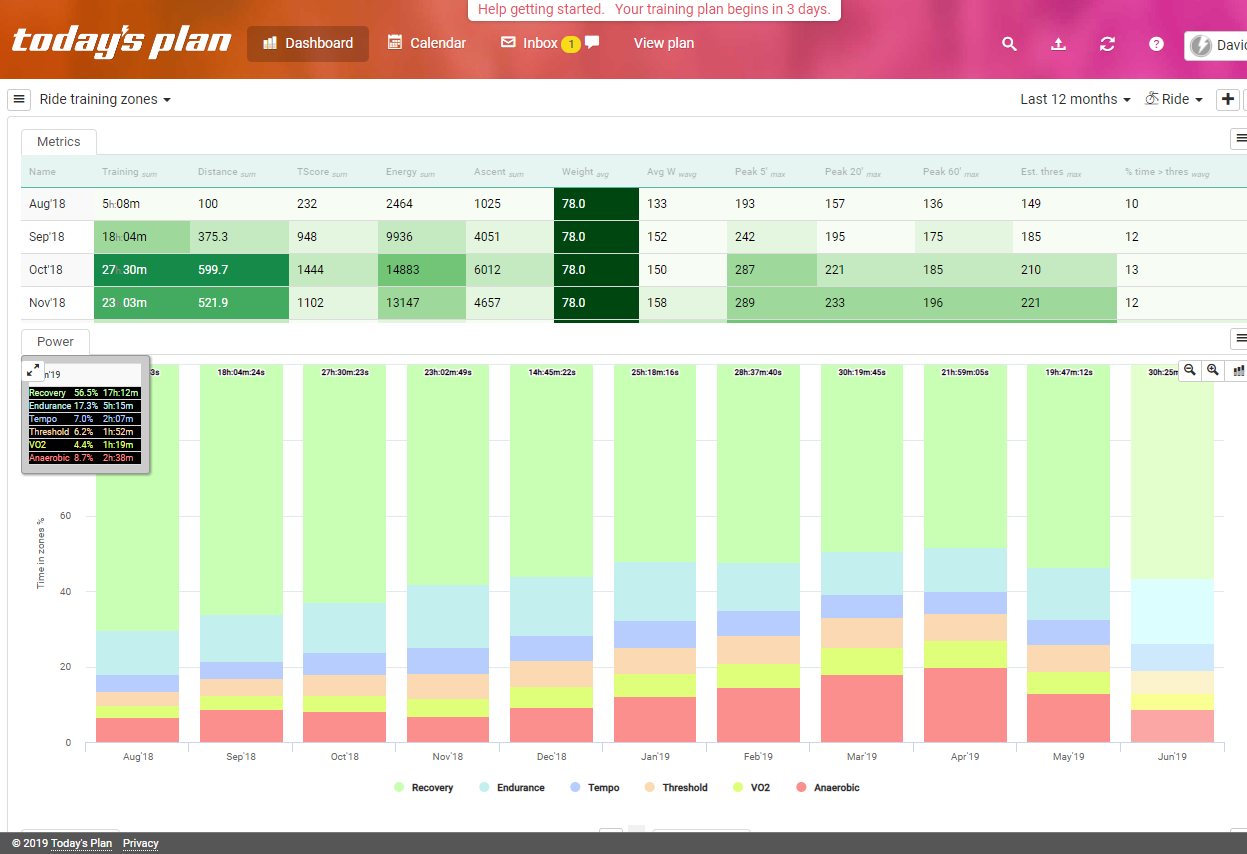
Metrics: A table of KPI’s as described above in Ride Training Summary.
Power: A bar chart of power zones by month, with drill in to week and activity.
Power Distribution (Watts): Your Power distribution over the last 12 months, with drill in to year, month and week.
Distribution (HR): Distribution of Heart Rate over the last 12 months with drill in to year, month and week.
Scheduled vs Completed Duration: A comparison of planned vs actual activity duration by year. With drill in to month and week.
Dashboard View: Ride Trend Tracking
![]()
Power: A bar chart of power zones by month with drill in to week and activity.
Average Power by Heart Rate: A line chart comparing average power this year against previous year by heart rate. Drill in to compare by month, week and activity.
Distribution – Time above Threshold by activity time: With drill in to year, month, and week.
Distribution – Average Temp vs Average HR: With drill in to year, month, and week.
Distribution – Energy: With drill in to year, month, and week.
How to Change the Default Dashboard Views or Add a New Dashboard View
You can customize the layout of existing dashboard views or clone a view. You can’t reset the dashboard but you can reload the default bundle or replace the default views with blank views.
Only cycling and running currently have default dashboard bundles (Templates). Other sports require you to build your own views. This is very easy to do.
With a dashboard tab selected click on the top left hamburger menu.
These options are self explanatory. To reset the dashboards click on + Add
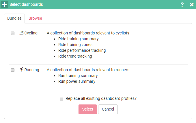
To reload the default cycling dashboard and overwrite any changes you have made go to the bundle tab and check the boxes: “Cycling” and “Replace all dashboard profiles?”
You’ll get a warning asking if you really want to do this, click OK if you want to go ahead.
If no dashboard template (bundle) exists or if you don’t want to use a template
Click on the Browse tab and select a sport. You can delete any existing sports if it’s not relevant or you can leave it and add your new sport or multiple new sports.
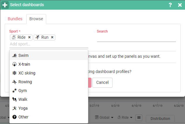
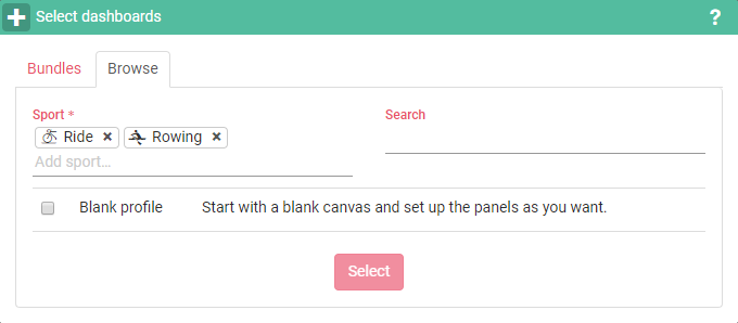
Check the blank profile field and this popup appears which allows you to select the charts you want to see:
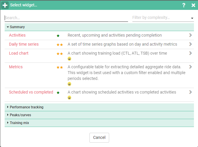
Select one of these charts (called widgets or panels). The new Dashboard will appear with the default name: My Dashboard. And with this chart (panel) added.
To add more charts click on the + symbol top left and the chart picker appears again to let you choose your next chart.
To reorganize the charts on the view Just hover over the chart header until you get the 4 pointed arrow and then left mouse click and drag and drop it to its new location.
To rename your new dashboard: In the dropdown, top left and to the right of the hamburger menu you will see your new dashboard named:
“My Dashboard”
Select this dashboard click on the hamburger menu and select rename
You will get this popup
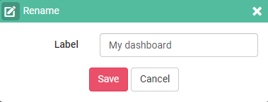
Click the save button, your dashboard is renamed
How to Set Dashboard Global Options and Chart Options
Lets you set global defaults for all charts in view, the options are:
- Select Date Range from dropdown
- Select one or more activities from dropdown
- Add Panel (chart) to Dashboard)
- Help
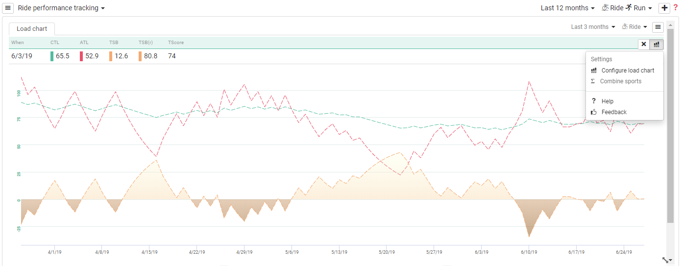
You can set the defaults for each Panel (chart) independently of the global settings above. These are accessed via the hamburger menu top right of each panel, changes made here affect ONLY that panel. They override the global settings for that panel.
Clicking on the hamburger menu lets you switch custom filters on or off. Selecting on reveals the date range dropdown and the activity type filter you can select one or multiple activities.
You can also add a new tab to the panel so that you can add charts without taking up more screen space. Clicking “add tab” shows you the chart selector pop up. This menu also lets you delete a tab.
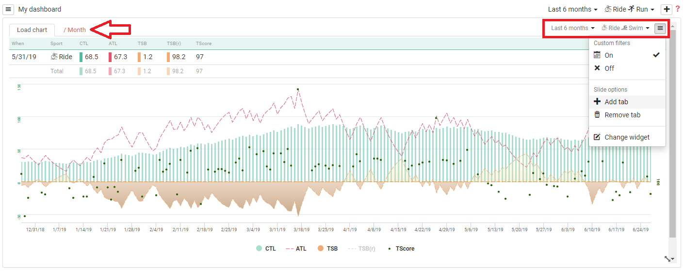
Note: You must have at least one dashboard. If you add additional dashboards, then your left top hamburger menu gets a new item: Delete Dashboard
You can see I have used the Hamburger menu top right to set a chart specific filter: Last 3 months/ride to override the global dashboard filter Last 12 Months/Ride & Run
Hovering just below the hamburger menu reveals an x which lets you hide the table above the chart (Green line) to get this table back click on the chart icon next to the cross to open the configuration popup and select restore to defaults and save.
You can also combine multiple sports.
Hovering over a plot highlights it and changes the table to reflect the values for that data point
On the configuration popup you can select metric visibility, plot types, lines/symbols and colors
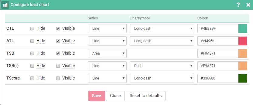
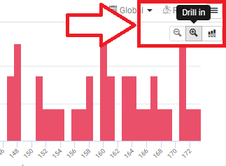
Chart Drill in
This is a great feature. The view initially shows the overall values for the period selected by clicking on the magnifying glass top right of the chart you can drill in to the data to see more granular values displayed by year and then by month and finally by week.
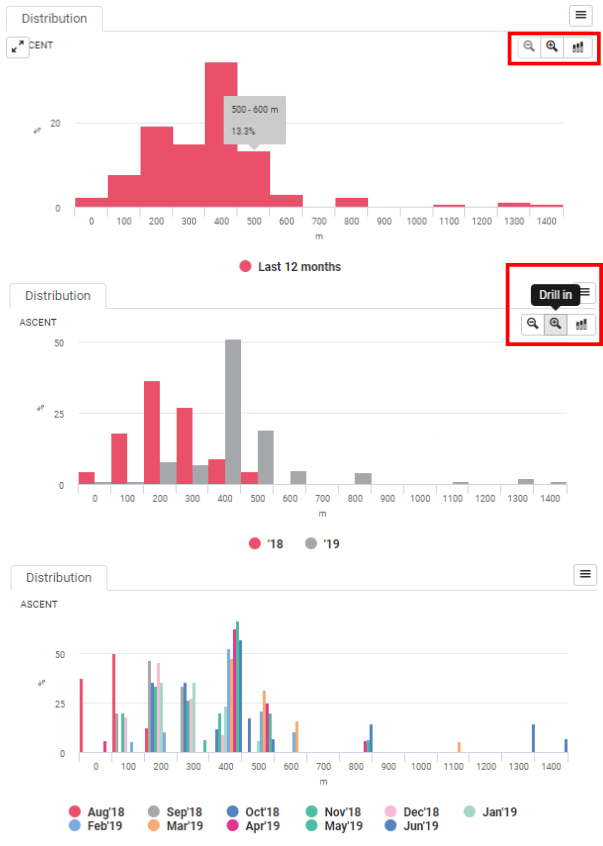
Hover over a chart to reveal the drill in menu. Click + to drill in – to drill up.

