Strava Summit Analysis Pack In Detail
Relative Effort (Analysis Pack)
Location: Left Hand Side Menu
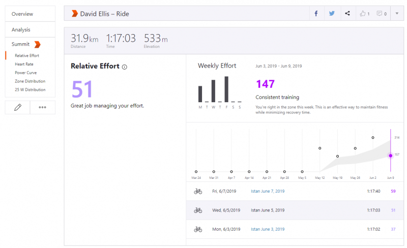
Relative Effort is an analysis of your heart rate data. Relative Effort was inspired by the concept of TRIMP (TRaining IMPulse) coined by Dr. Eric Bannister.
Workout Analysis – Running (Analysis Pack)
Workout Analysis graphs each split made when you use your device’s lap button or autolap function. This allows you to visualize pace zones and lap data.
If you don’t use laps you’ll see your splits by km/mile depending on your default measurement setting.
Distance, time and pace for every lap or split is shown on a bar graph. Pace zones are displayed in different shades of blue making it easy to see your intensity levels for each effort.
Below the chart you’ll see a numerical analysis of your distance, elapsed time and pace for each lap or split. Scrolling through the chart and highlighting sections of your activity reveals more about your pace zones.
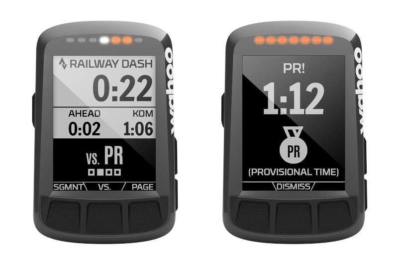
Live Segments (Analysis Pack)
This is essential if you want to compete against yourself or others over segments, or just to know where segments start and end when you’re on the road.
Live segments shows your time to complete starred segments in real time, with a warning as you approach the segment and a comparison/countdown against your PR or the current KOM/QOM/CR depending on default setting.
When you finish the segment you’ll get a time and an award if appropriate. (Any awards are provisional until you have uploaded the activity to Strava).
Live segments are available on Strava Free. You’ll get the start cue, progress on a map and end result but NOT the comparison metrics. Honestly you should be riding full gas not watching the screen so maybe this is good enough for you.
For live segments to work on your phone you need a data connection. Compatible devices such as Garmins and Wahoo Elemnts support live elements natively without the need or a data connection.
Heart Rate Analysis (Analysis Pack)
Location: Left Hand Side Menu
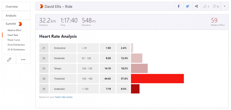
Training with a heart rate monitor is really important, even if you have a power meter and especially if you are an older athlete.
Strava Free supports heart rate monitors; the Summit pack adds the nice analysis shown below.
Golden Cheetah offers a more detailed analysis for Free
Power Analysis (Analysis Pack)
The power meter is one of the best tools for measuring your performance potential and tracking your improvements as a cyclist. If you don’t have a power meter and are happy to review power post activity then you can rely on Strava estimated power or use GoldenCheetah to provide a more accurate power estimate.
Strava Analysis includes these Power Analysis tools:
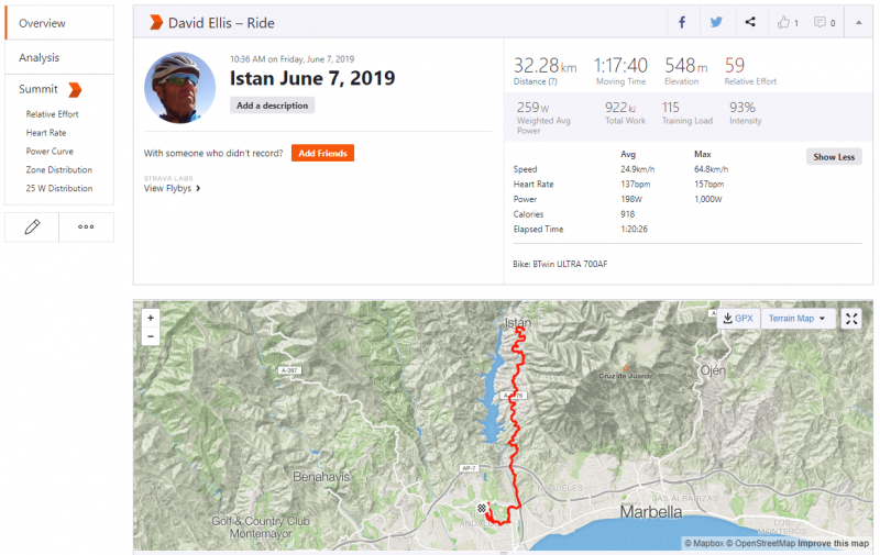
Total Work
Location: Activity summary panel
Total Work, measured in Kilojoules or KJs, is the total amount of energy you’ve expended during your activity. It’s roughly equal to calories burned.
Training Load
Location: Activity summary panel
Training Load tells you how much stress an activity put on your body.
The calculation is based on your Functional Threshold Power. A training load of 100 is your baseline and equal to riding full gas for one hour. The training load number shows how hard that activity was compared with your baseline.
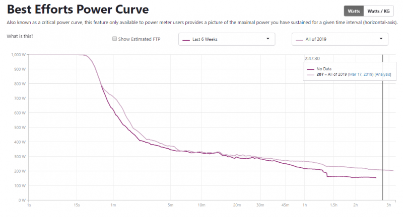
Power Curve
Location: Left Hand Side Menu
Power Curve shows you the highest average power for various durations during your activity and lets you compare them to previous efforts.
You can filter by your recent numbers, by year or set a custom range to see if you are putting out the best power numbers of the season or if you’ve set an all-time best.
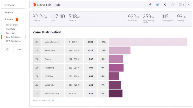
Power Zone Distribution
Location: Left Hand Side Menu
Power zones are split up as different levels of exertion. Similar in concept to heart rate zones, knowing your Power zones during an activity is a critical training tool. The zones go from Z1 to Z7, with Z1 being coasting and Z7 being a sprint.
Intensity
Location: Activity summary panel
Intensity shows how difficult an activity was. The calculation compares your Weighted Average Power for the activity and compares it to your Functional Threshold Power. For example, if your Weighted Average Power is 227W and your FTP 280W, then your Intensity would be 81%.
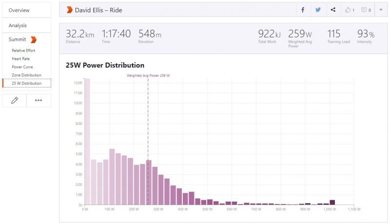
25 Watt Distribution
Location: Left Hand Side Menu and in Activity summary panel
Similar to the Power Distribution by Power Zones, the 25W Distribution simply puts each 1 second of power into a 25W training zone from 0 to the highest power output on the ride
Weighted Average Power
Location: Activity summary panel
Weighted Average Power looks at all of your power variations and provides an average power for your ride. This is a better indicator of your overall effort than simply taking your average power.
Examples include criterium races, mountain biking or hilly activities. Weighted Average Power lets you more accurately compare the effort between these uneven activities and steadier efforts.
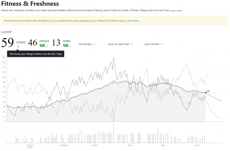
Fitness and Freshness (Analysis Pack)
Location: Top Menu > Training
The Fitness & Freshness graph lets you monitor your progress throughout a season, helps you recognize signs of overtraining and allows you to manage your taper towards key events.
Fitness & Freshness is the equivalent of TrainingPeaks Performance Management Chart (PMC).
Golden Cheetah offers more detailed analysis of all these metrics for Free. The Elevate free Chrome extension also includes this chart.
Read More .....


