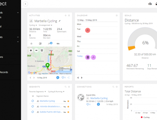
Cyclists need to be able to handle a number of different real-world scenarios such as sprinting, hill climbing, and energy saving, easy pedalling.
We all tend to gravitate towards a force/cadence scenario that suits our physiology. A combination of factors, including muscle mass and muscle fibre type, influences our pedalling style but it’s important we train to improve our abilities in areas where we don’t naturally excel.
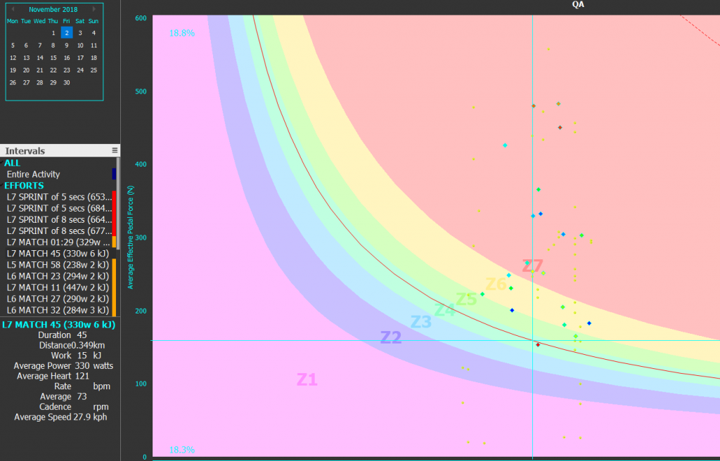
Quadrant Analysis lets you to easily do this as it allows you to see a snapshot of what kinds of effort went into your performance.
What I love about this chart is that it is so simple to see the Story! Am I Spinning or am I Grinding? Bang it's right there in your face.

What do the Quadrants Represent
A QA chart plots the relationship between pedal force on the Y axis and the pedal velocity on the X axis. It is divided into 4 Sectors or Quadrants, each one representing a key riding style as follows:
- Quadrant I (upper right): High cadence, high force. Sprint type work.
- Quadrant II (upper left): Low cadence, high force. Hill climbing work, Standing Starts.
- Quadrant III (lower left): Low cadence, low force. Easy pedalling, (in the pack or while resting between intervals).
- Quadrant IV (lower right): High cadence, low force. Fast pedalling with little resistance, (sitting in the middle of a pack or pedalling downhill.).
The percentages in each corner show the proportion of ride time spent in that quadrant
The larger Diamond shaped elements are the average values for each interval.
The red curved line shows the point at which pedal forces and pedal speeds combined, equal your Critical Power (CP - Which is entered in the chart settings)
The dotted red curved line shows the point at which pedal forces and pedal speeds combined, equal your Maximum Power (Pmax - Which is entered in the chart settings)
The Quadrant split is determined by the value you enter for RPM in the chart settings.
The Crank Length - determines the correct values and scale for the X-Axis and is defaulted from your 'Preferences -> Athlete' data
There Are Four Other Key Settings in Chart Settings:
Merge Intervals: if checked (and 'Frame Interval' is NOT checked) this shows the intervals selected in the 'Side Bar' but not the complete data points.
Frame Intervals: if checked - shows all data points - and highlights the intervals selected in the 'Side Bar'.
Gear Ratio: Data points are colored according to gear ratio.
Shade Zones: if checked, the power zones Z1 – Z7 are shown these are a percentage of CP and are set in the default area of the power zones in Athlete options.

How to Use QA to Quide Your Training
You should start adding training that pushes you into the extreme corners of the quadrant analysis during some of your rides.
Aim to spend more time in areas of weakness. Beware of repetitive, clustered data as this would show you are getting into a rut in your comfort zone.

Leave A Comment
You must be logged in to post a comment.